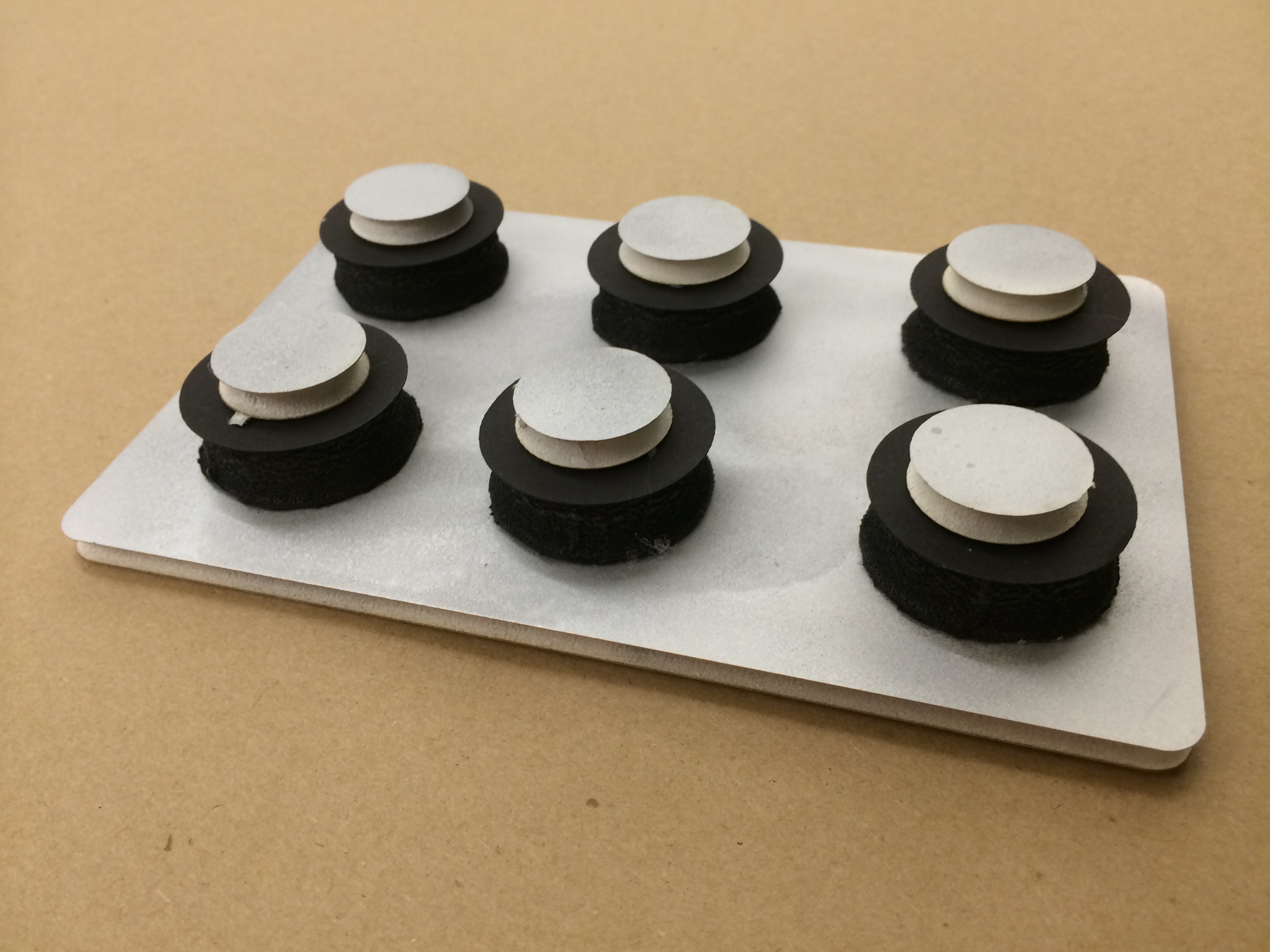
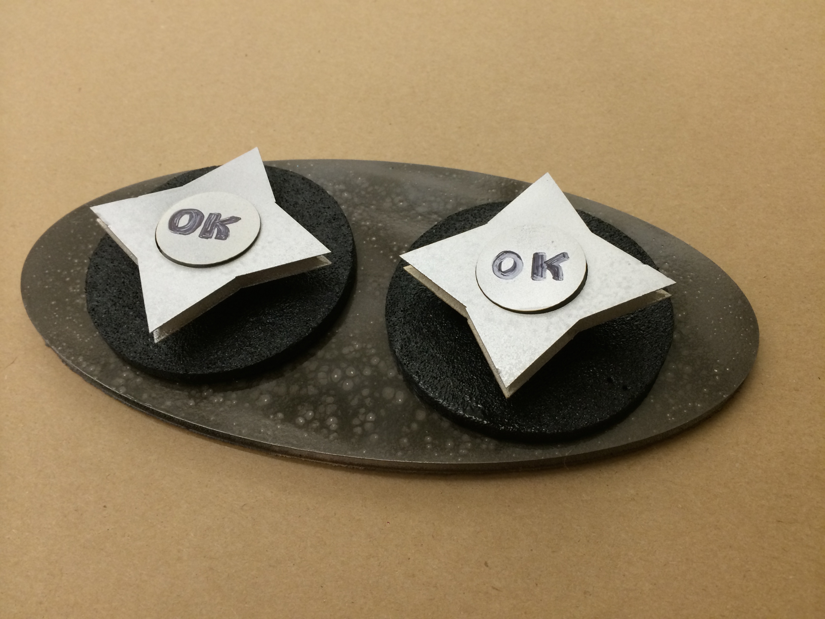
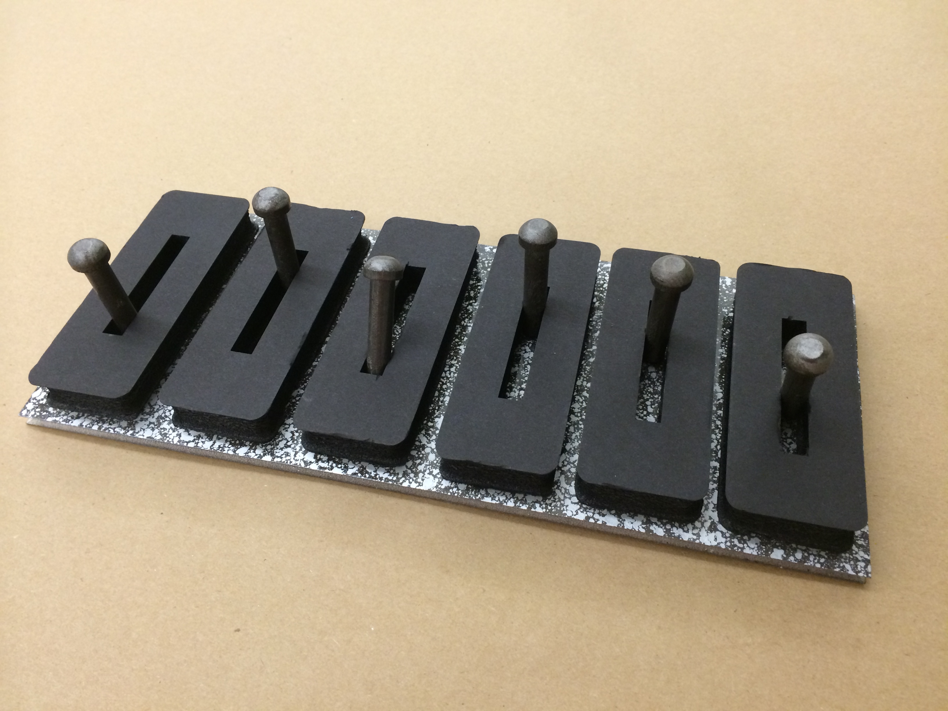
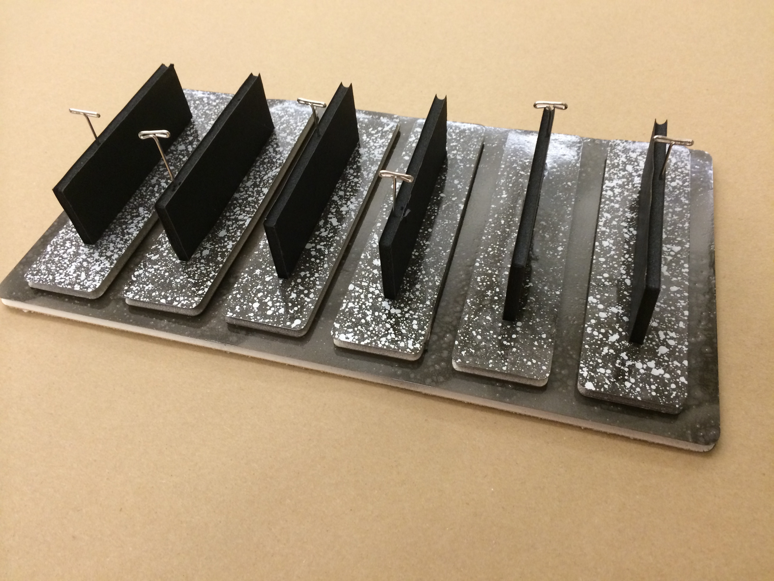
Control Panels: An exploration of buttons functions, types, and aesthetics, and their layouts for fun.

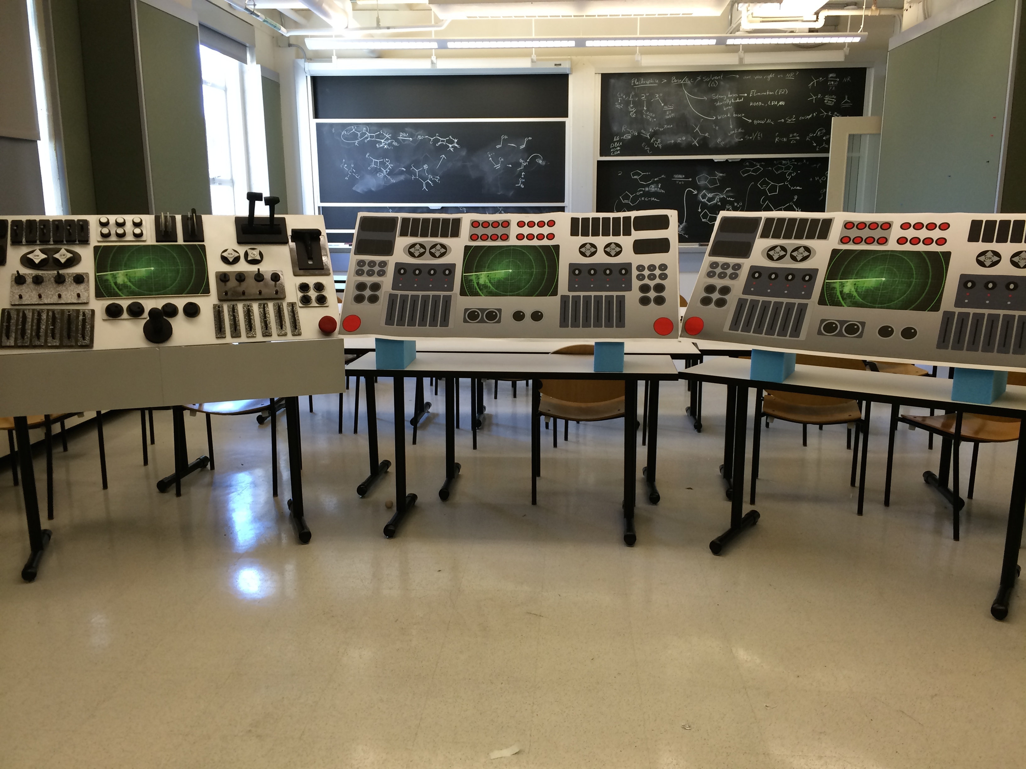
I explored the “feels-like” model for the Control Panel situated in the Command Room of the mothership. When under attack, the team will rush into the room, go through an eye scanner to verify they’re not the enemy, and the covers will retract, uncovering the Control Panel above for them to interact with. These three panels are designed as 6 stations (2 users at each panel).
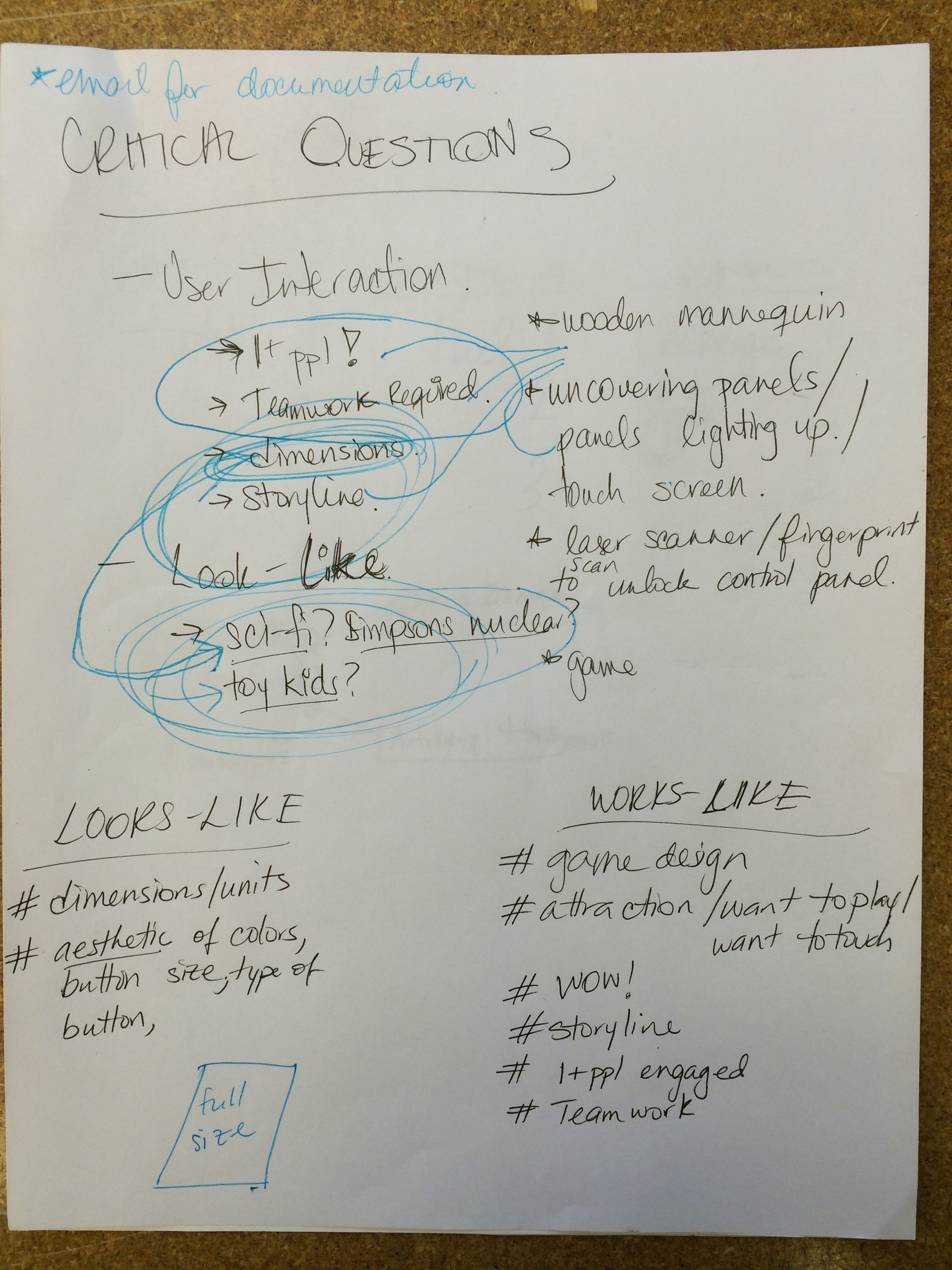
For my sketch model, I focused on the kinds of design elements that would make the user want to interact with the control panel, exploring a hierarchy of questions, like:
- What kind of buttons can execute the functions of our game design (choose a fighter, compare weapons, etc.) ?
- For each of these ‘functional buttons’, how many types of buttons exist (toggle switches, flippers, dials, cursors, etc.) ?
- For each of these types of buttons, what are some aesthetic elements that can change the industrial design of the button (bevel cuts, color patters, panel texture, layering sub panels, etc.) ?
- Overall, what button layout is most fun (high density, mirror imaged for each panel, etc.) ?
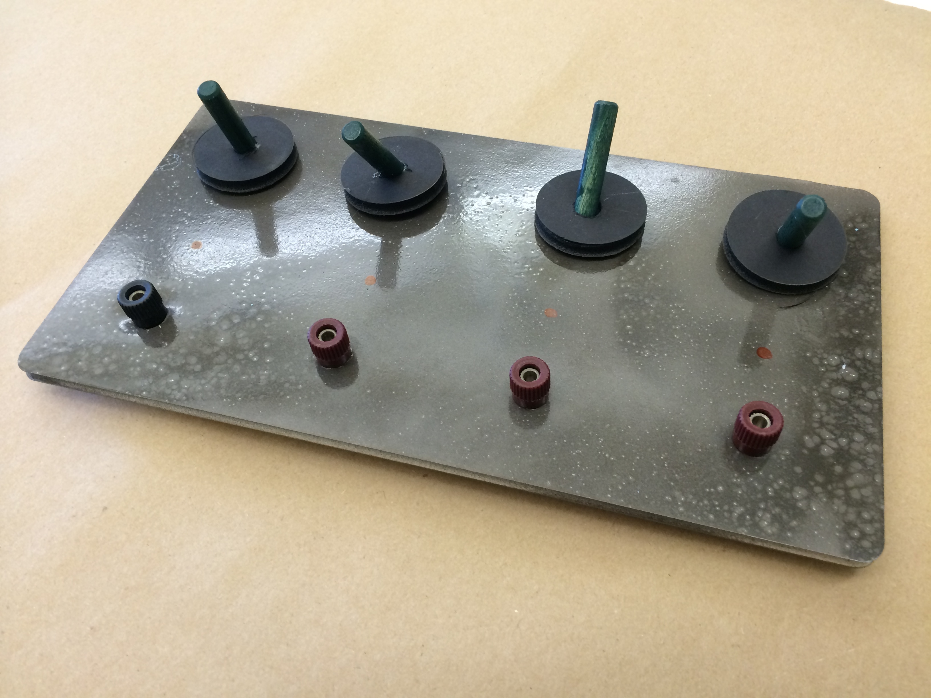
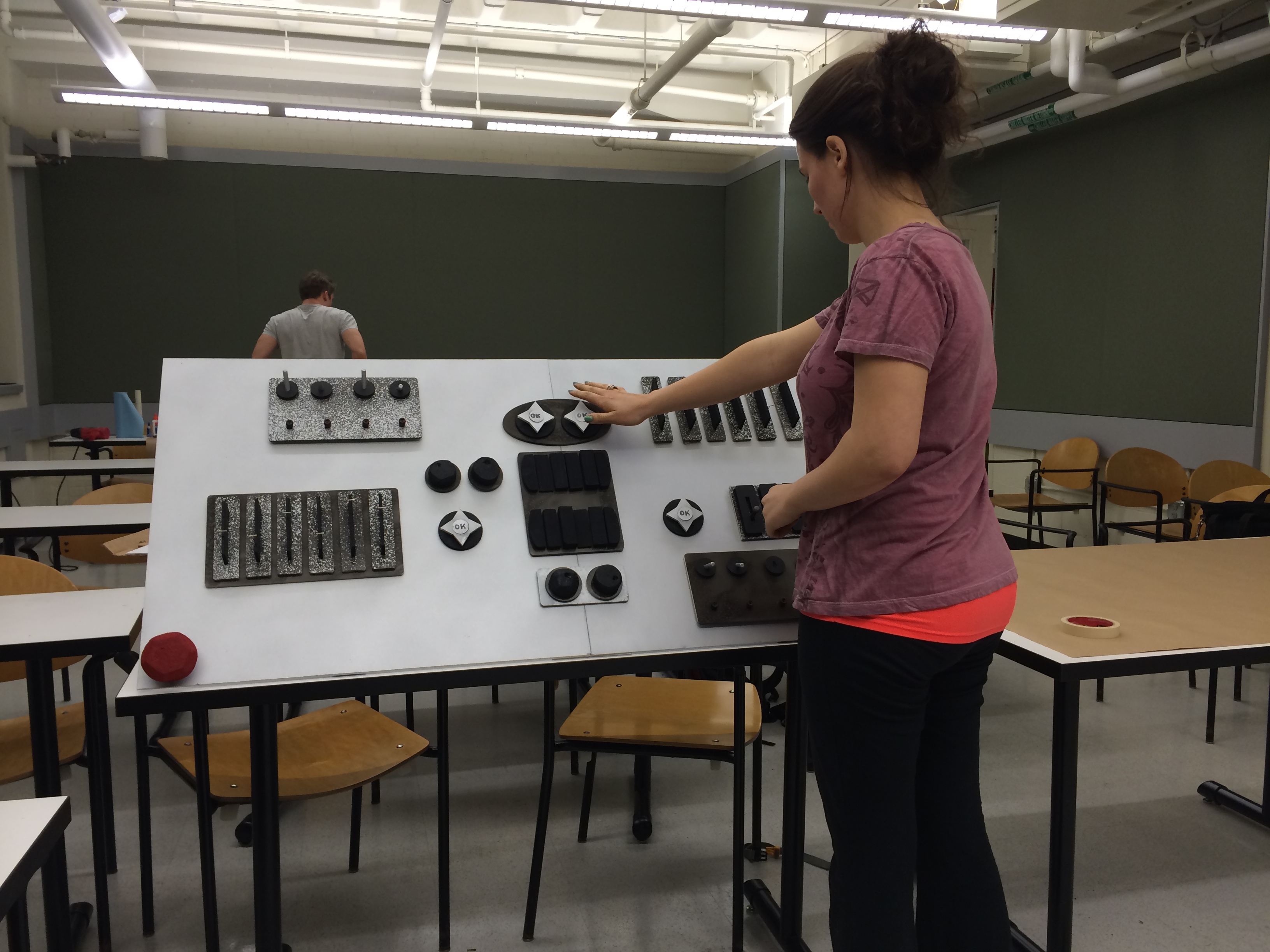
I made each button modular so that, if we pursue this Control Panel further, we can move each button around the panel and quickly test different configurations.
Read below for a glimpse of my design process, or jump to the bottom for a closer look at some buttons!
Button Functions

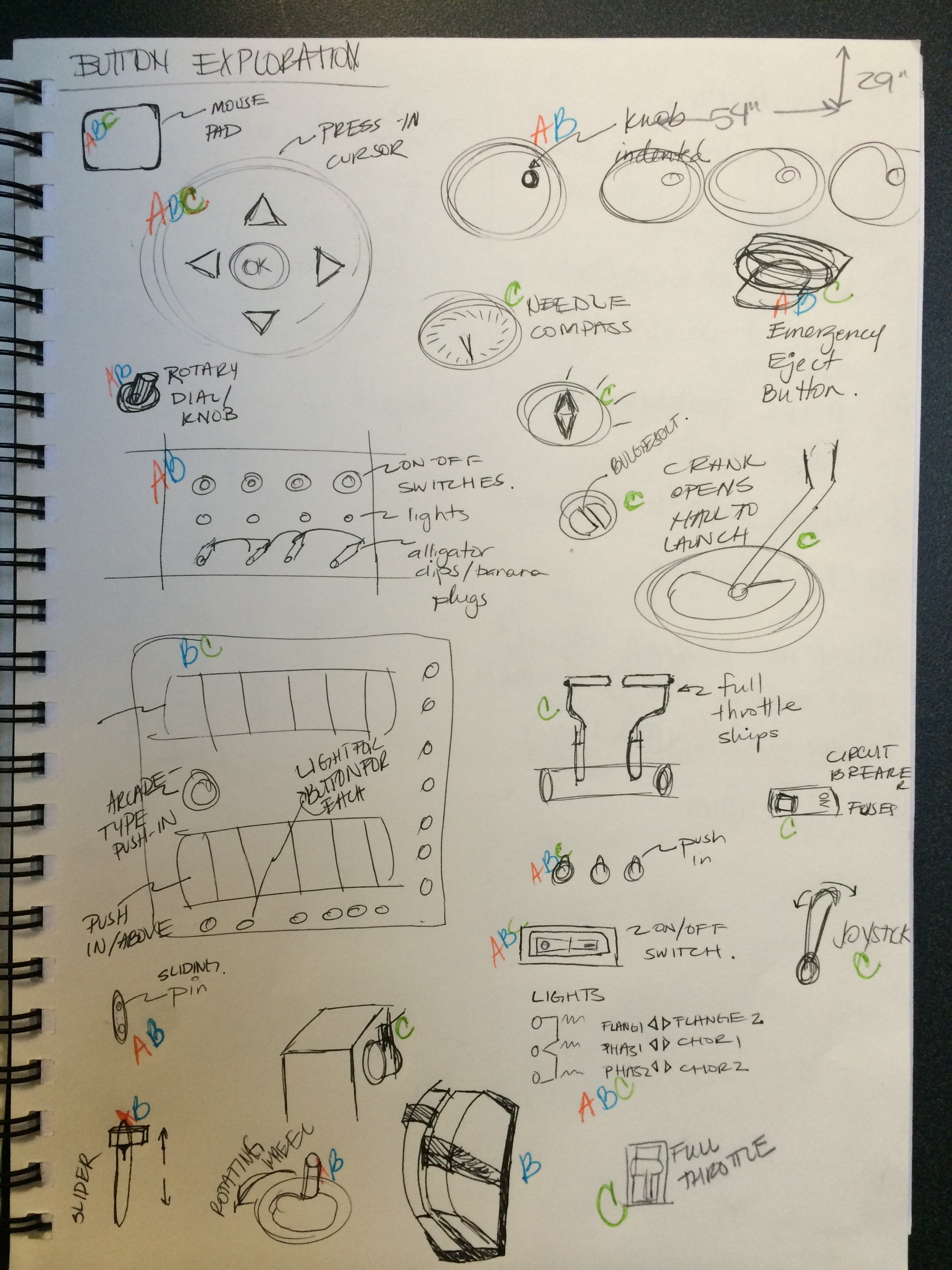
First, my teammate Chacha outlined our preliminary game design. The functions from here informed my 'Button Exploration' phase in order to identify the functions that I needed the buttons to have, for example:
- Steering the ship
- Moving between screens
- Comparing two items
- Browsing between options
- Selecting one option
- Launching misiles, etc.
Button Types


I found that there were multiple types of buttons that could serve for the same function. For example, a button with a selection function could be of multiple types:
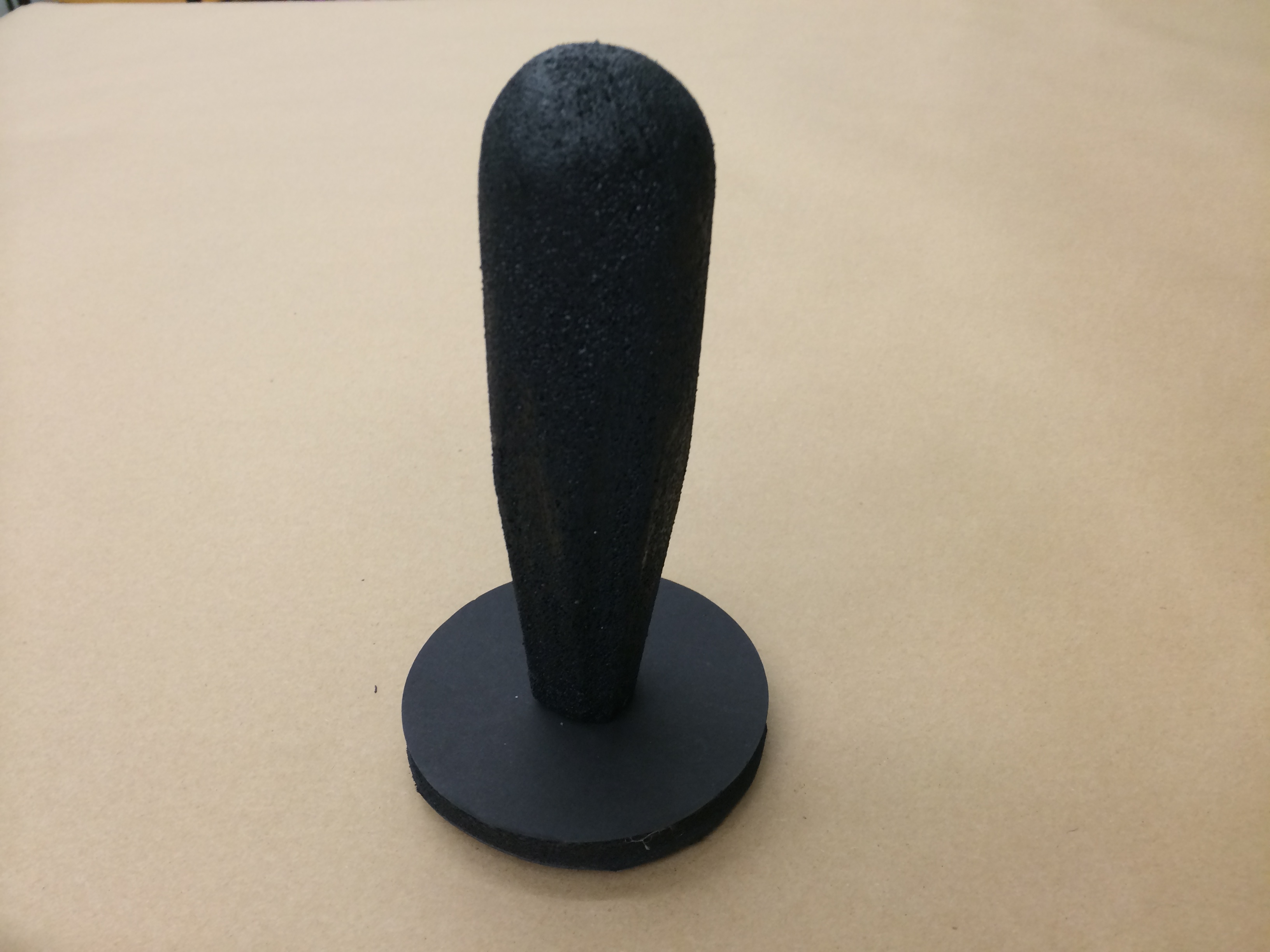
- a pinch dial,
- a rotarty dial,
- a dial with an indent,
- a toggle button,
- a switch,
- a cursor with OK in the center,
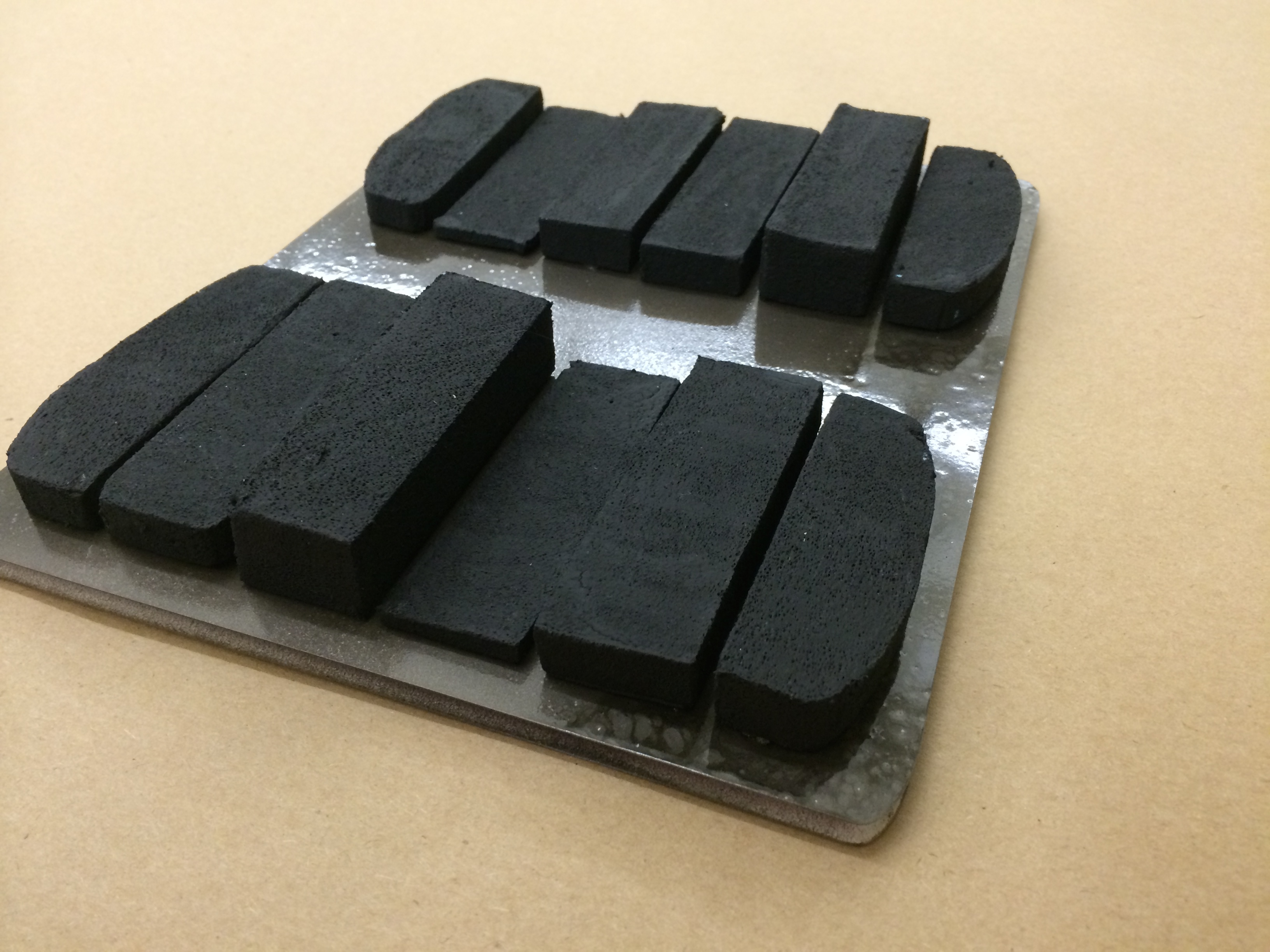
- a press/deslect row, etc.
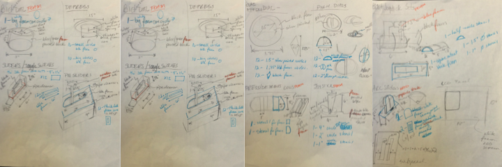
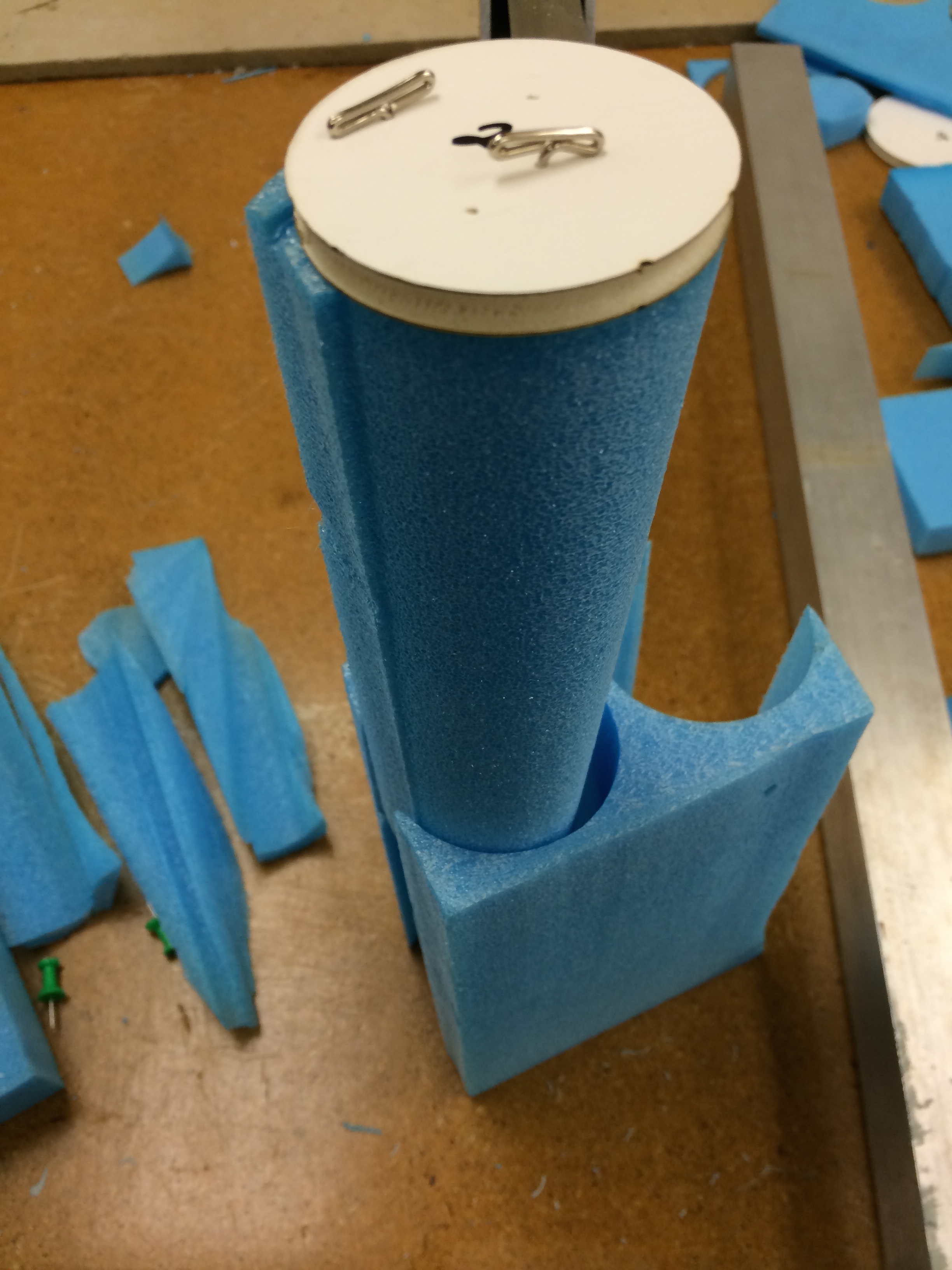
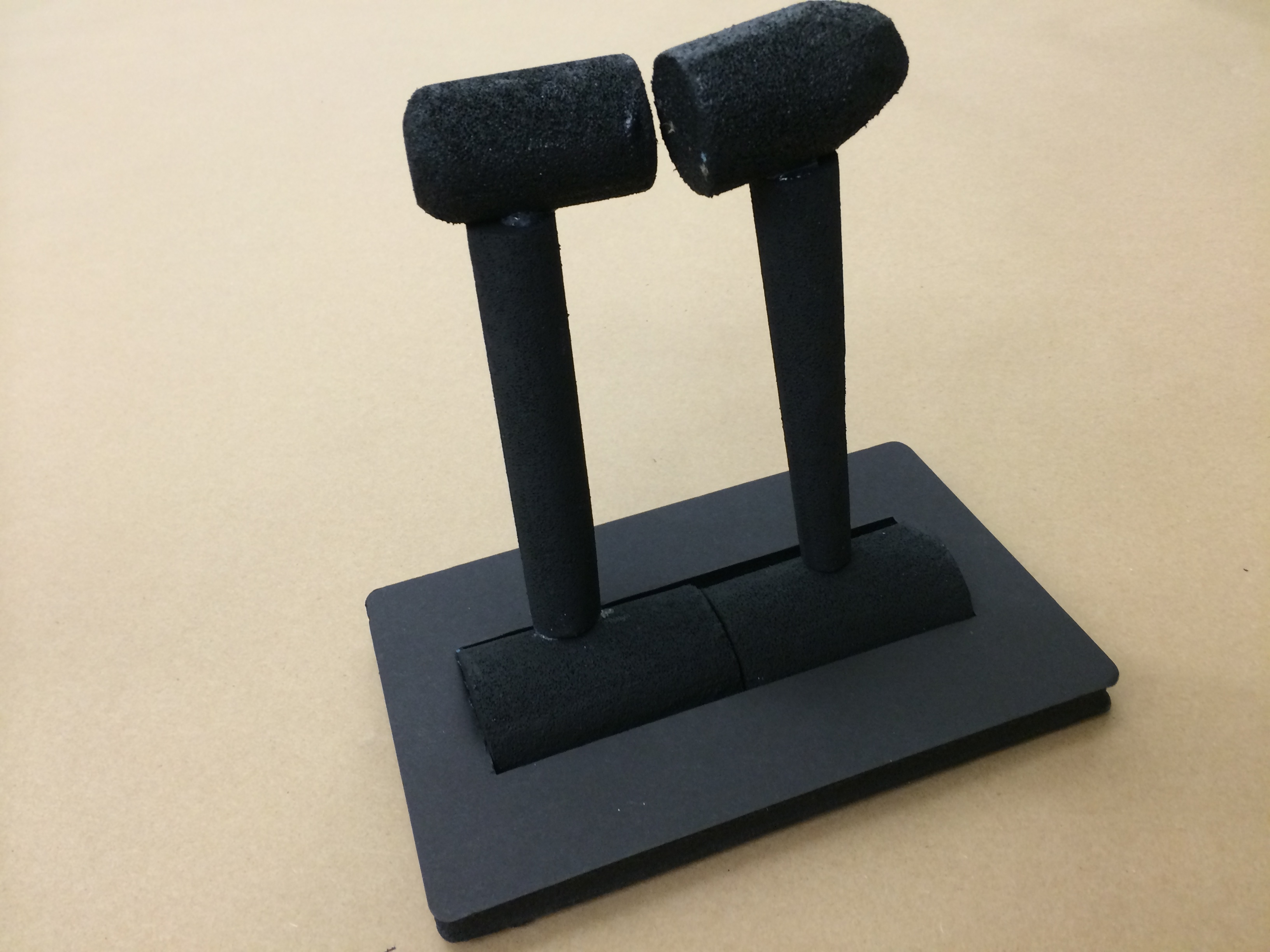
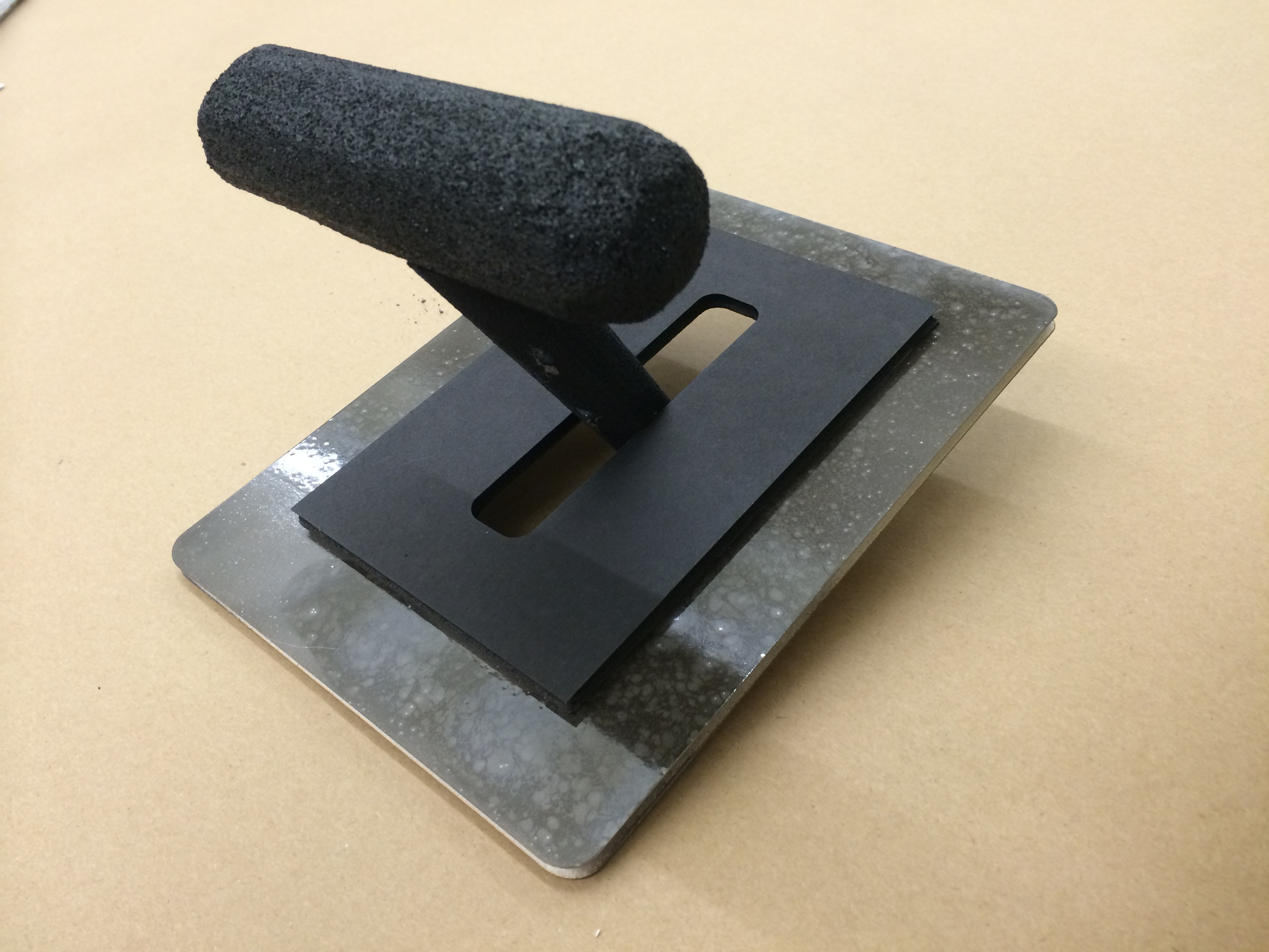
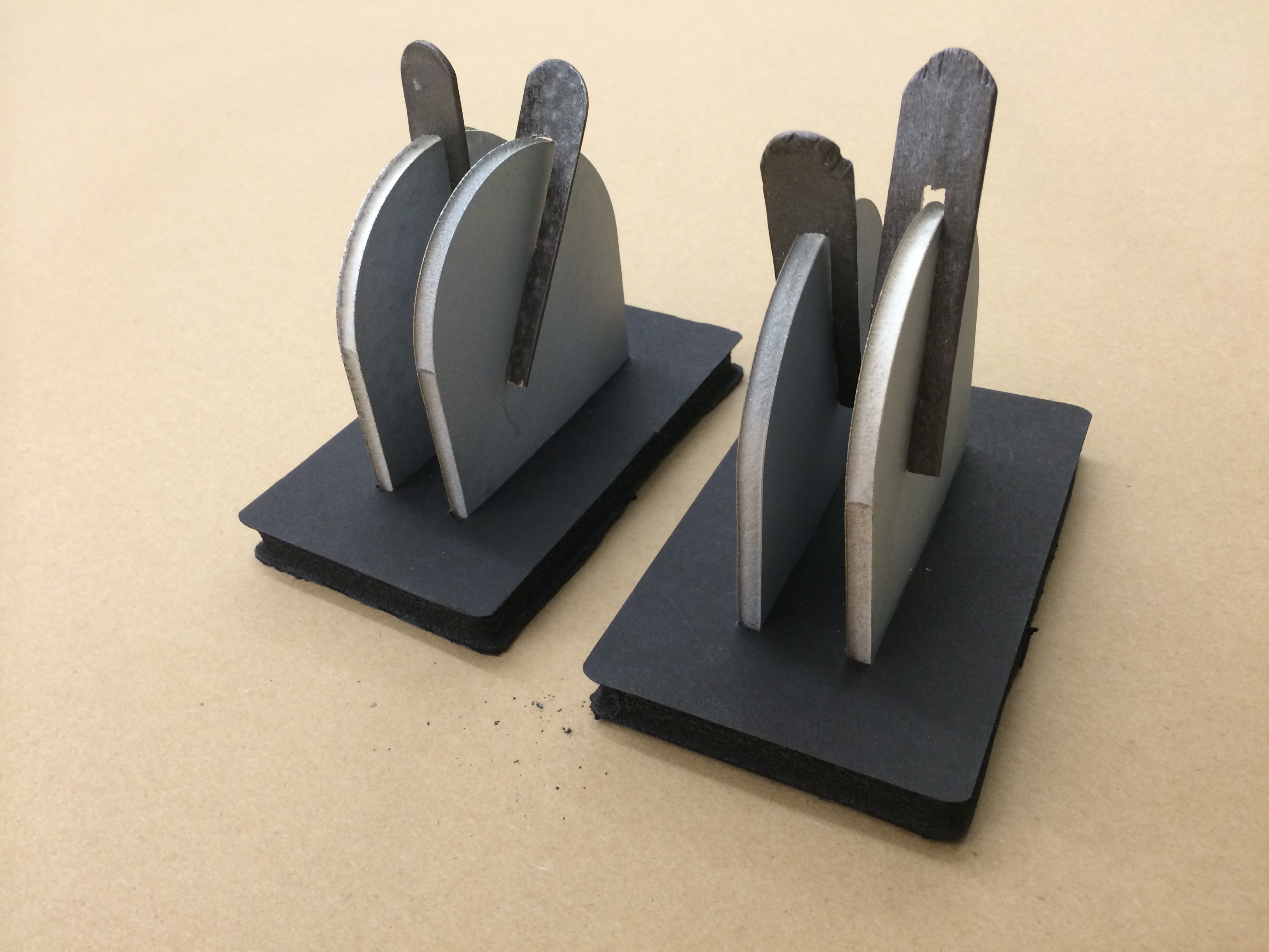
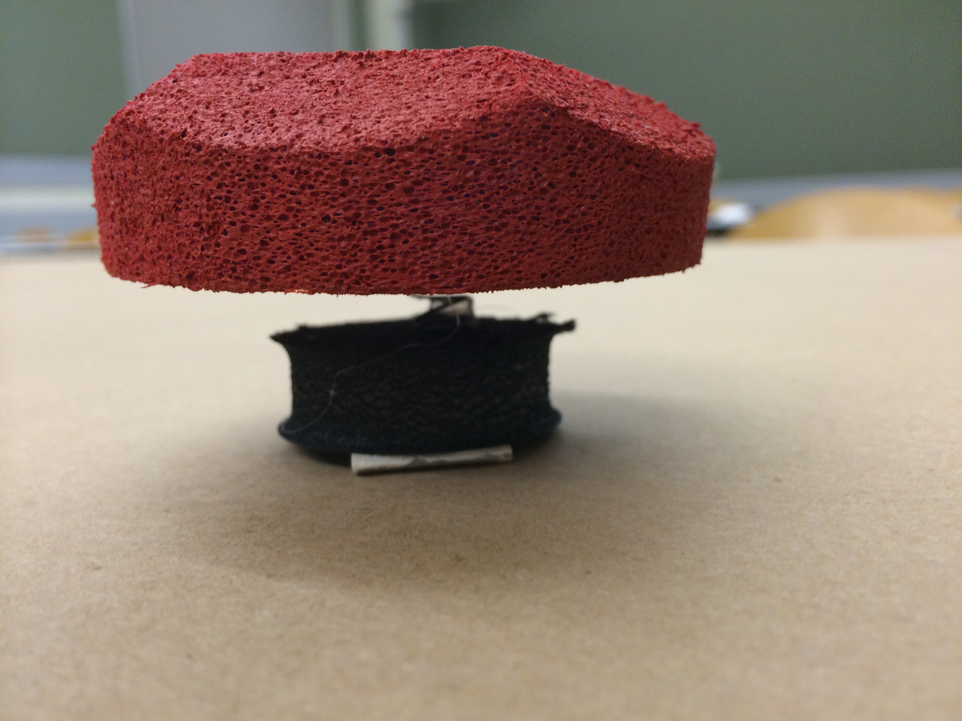
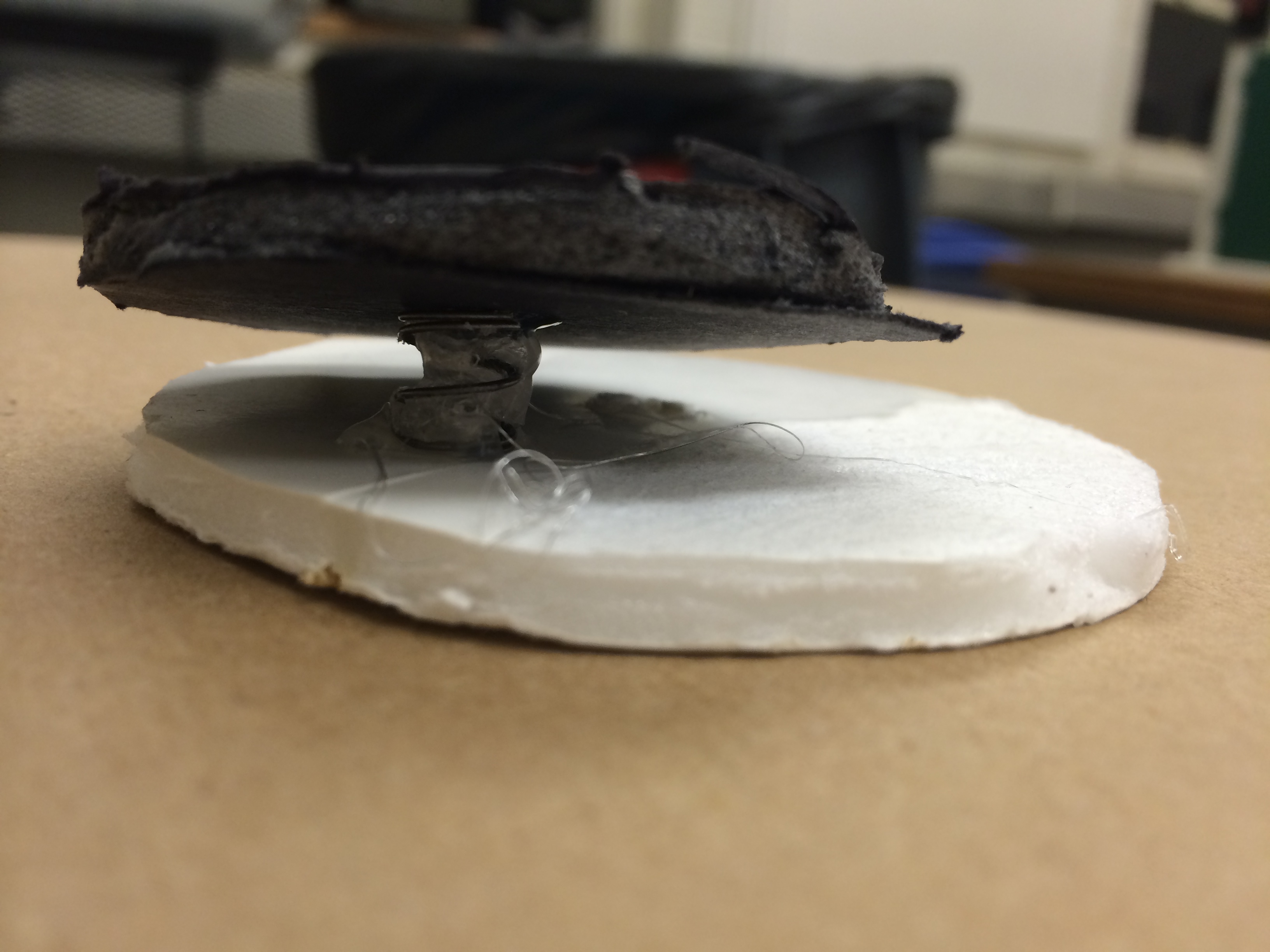
I sketched the ways that each of these types could be prototypes in order to represent their essential function so that, when displayed on the panel, it would simulate the feeling one would get when tempted to press the button. I mocked up each button type --83 to be exact-- and observed which buttons drew users' attention most.
Button Aesthetics
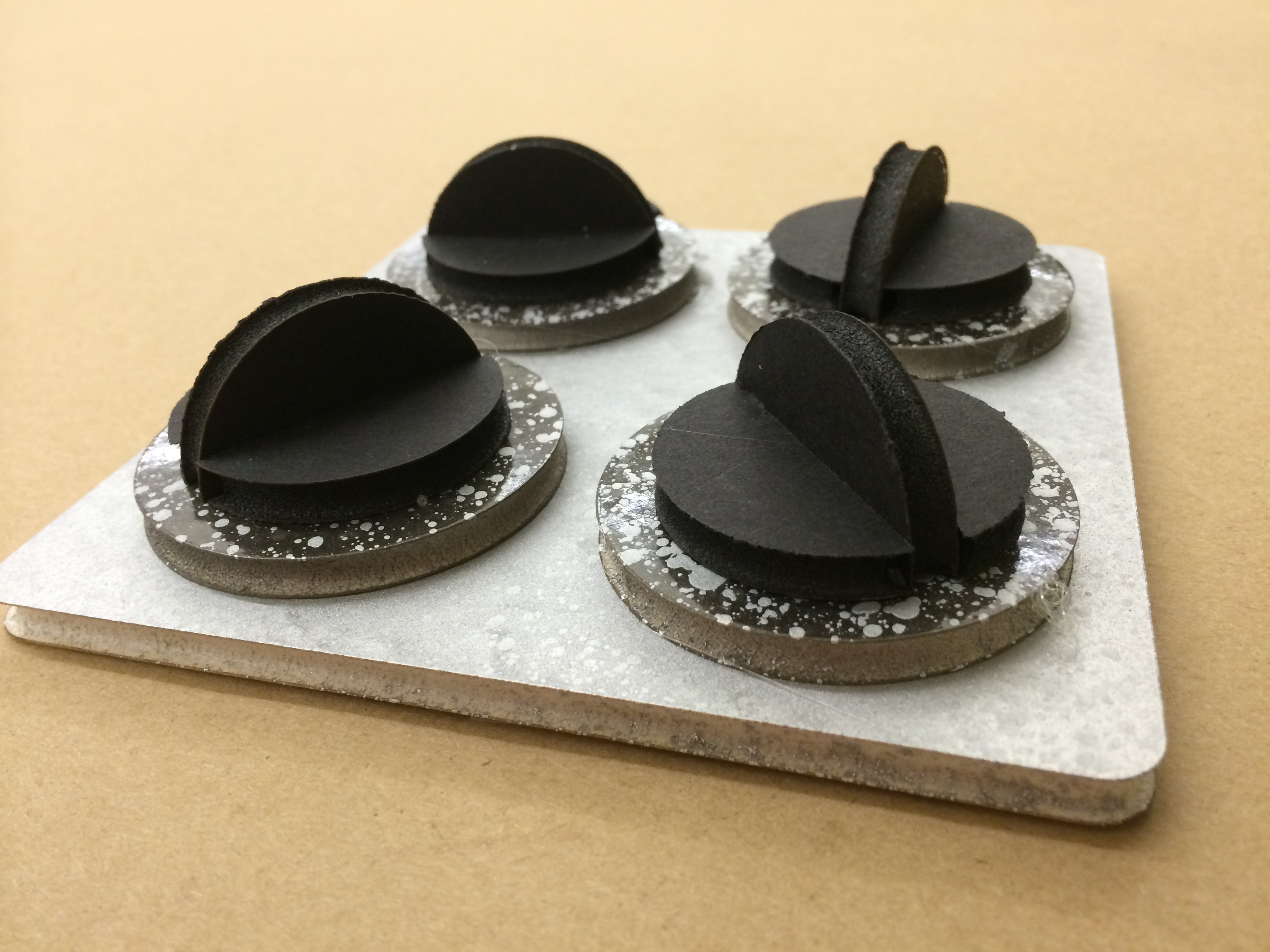
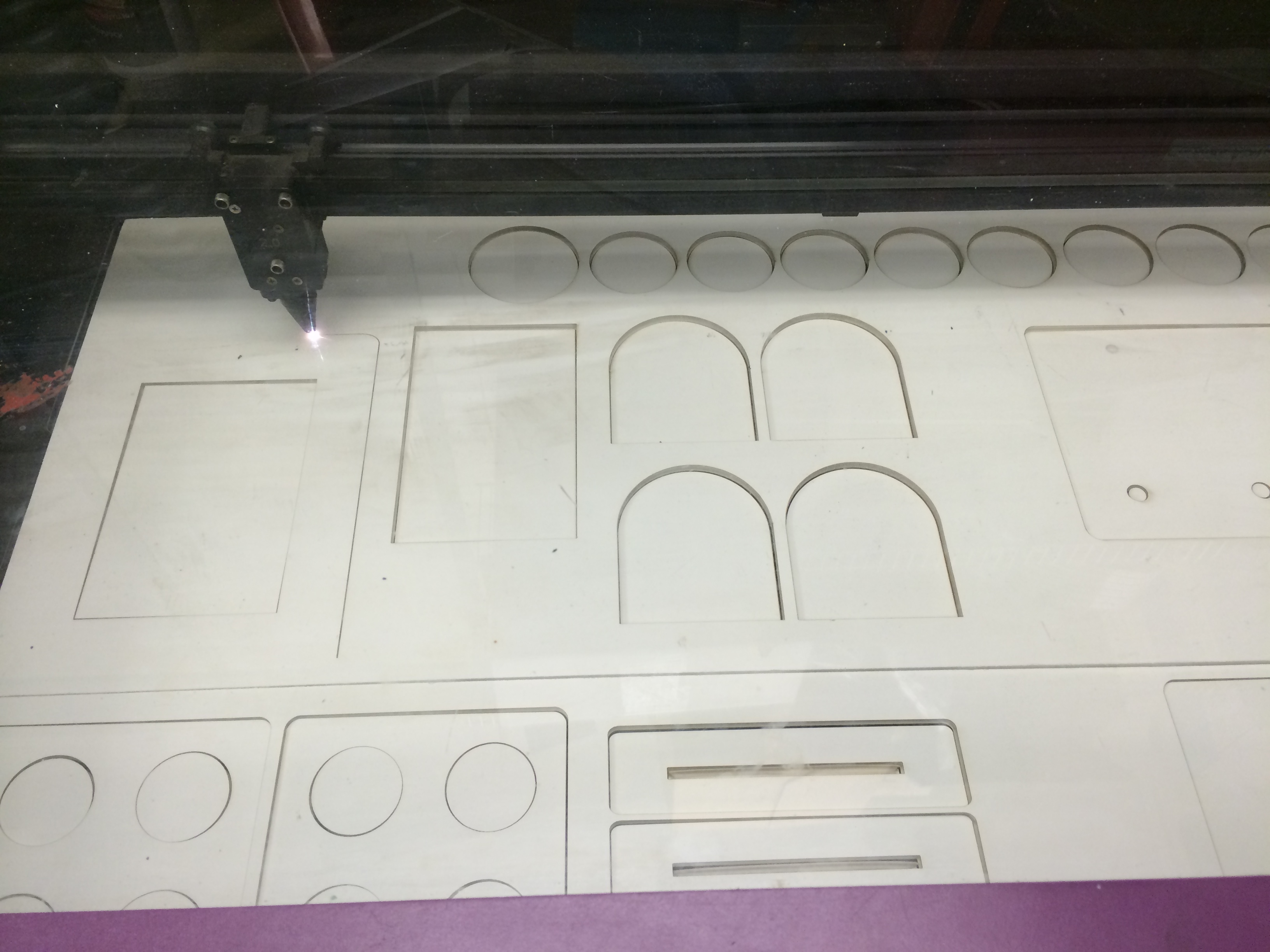
In this exploration, I worked through different colors, surface textures, sub-panels, corner shapes, and bevel designs.
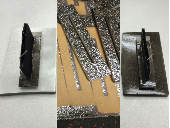
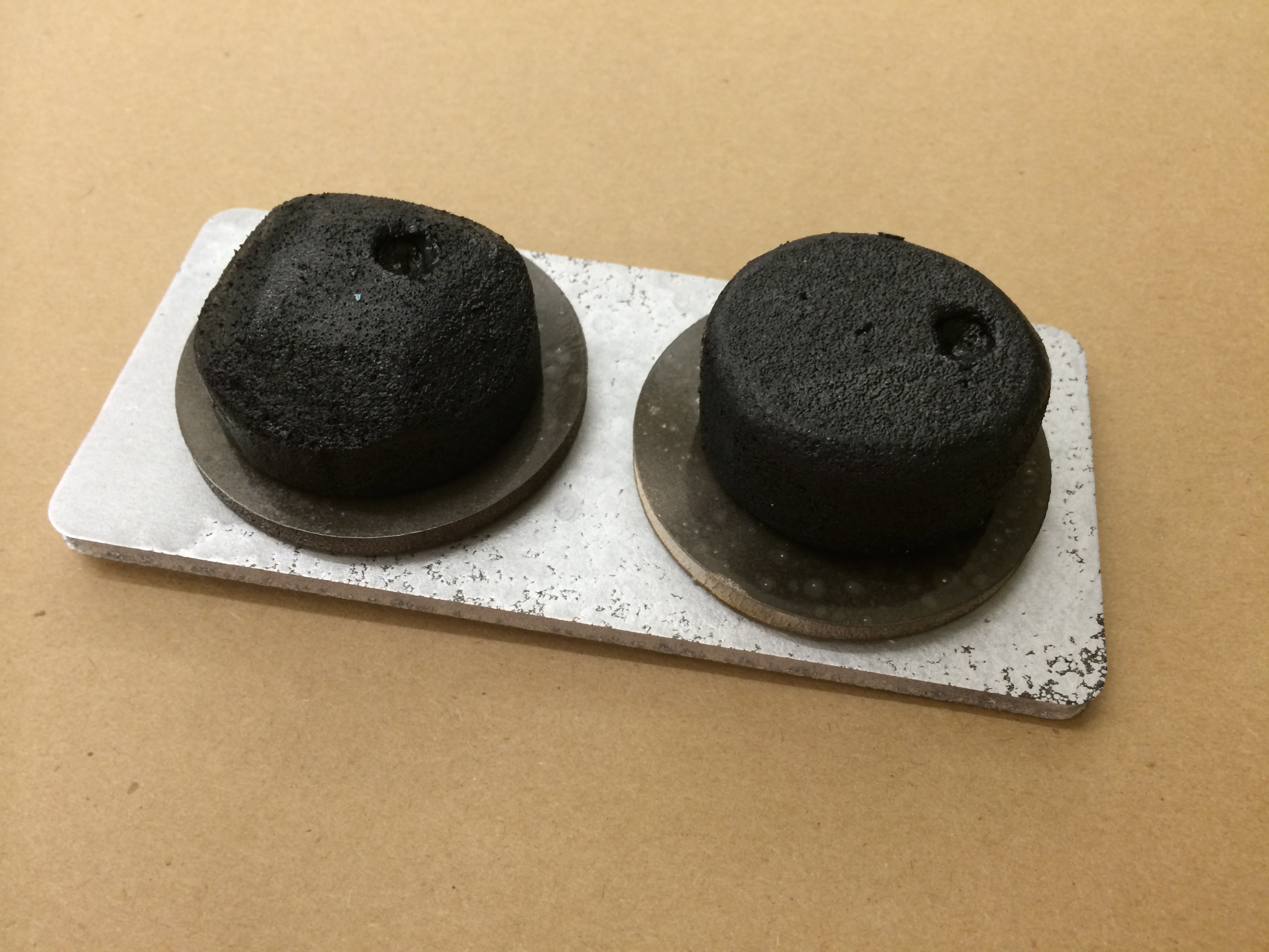
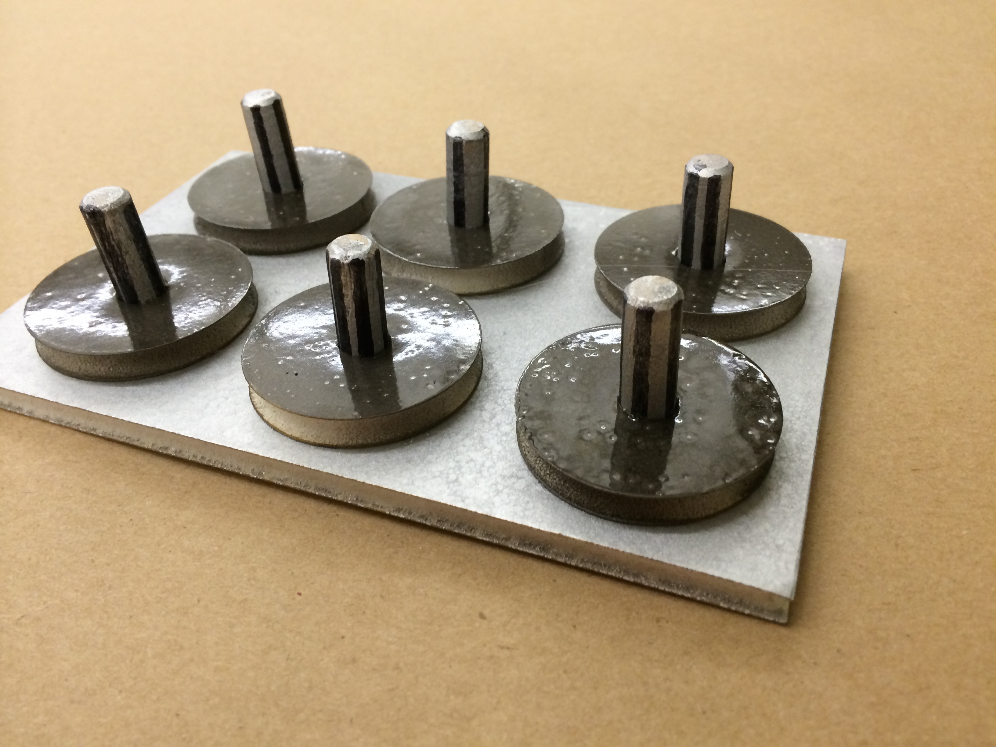
First, I wanted to play with the colors and texture that would be familiar to sci-fi Control Panels (and thereby believable). Silvers and greys worked well, and in general glossy paints over flat paints had more appeal and "new-ness" about them. A clean, smooth, aluminum-like silver worked well for the panel base, but each button coudl have textured paint in them to make them look more industrial and powerful. I painted some buttons with
a clean, smooth silver a textured metallic charcoal a layering of the textured metallic charcoal with splatter of the smooth silver (this seemed to be the most popular and draw the loudest "ooOOooOOh!" among passing labmates).
Next I wanted to explore whether the buttons would sit atop subpanels that grouped multiple of the same button type or if they should should sit individually directly atop the silver panel.
For most buttons, I made some mounted on subpanels, and some as standalone in order to easily get a visual comparison.
Then, I used the 4 possible combinations of rounded corners on buttons and subpanels, and 90-degree corners on buttons and subpanels.
Finally, I learned that what made the biggest difference in the overall aesthetic of the button was the surface's bevel cut. I played a bit with these and realized that straight edges felt more trek-ky and dangerous/risque, while curved bevels were more clean and futuristic. Definitely the shadoes cast from multiple faces on the straight edges were more interesting to the button and gave it more dimensions.

Button Layouts
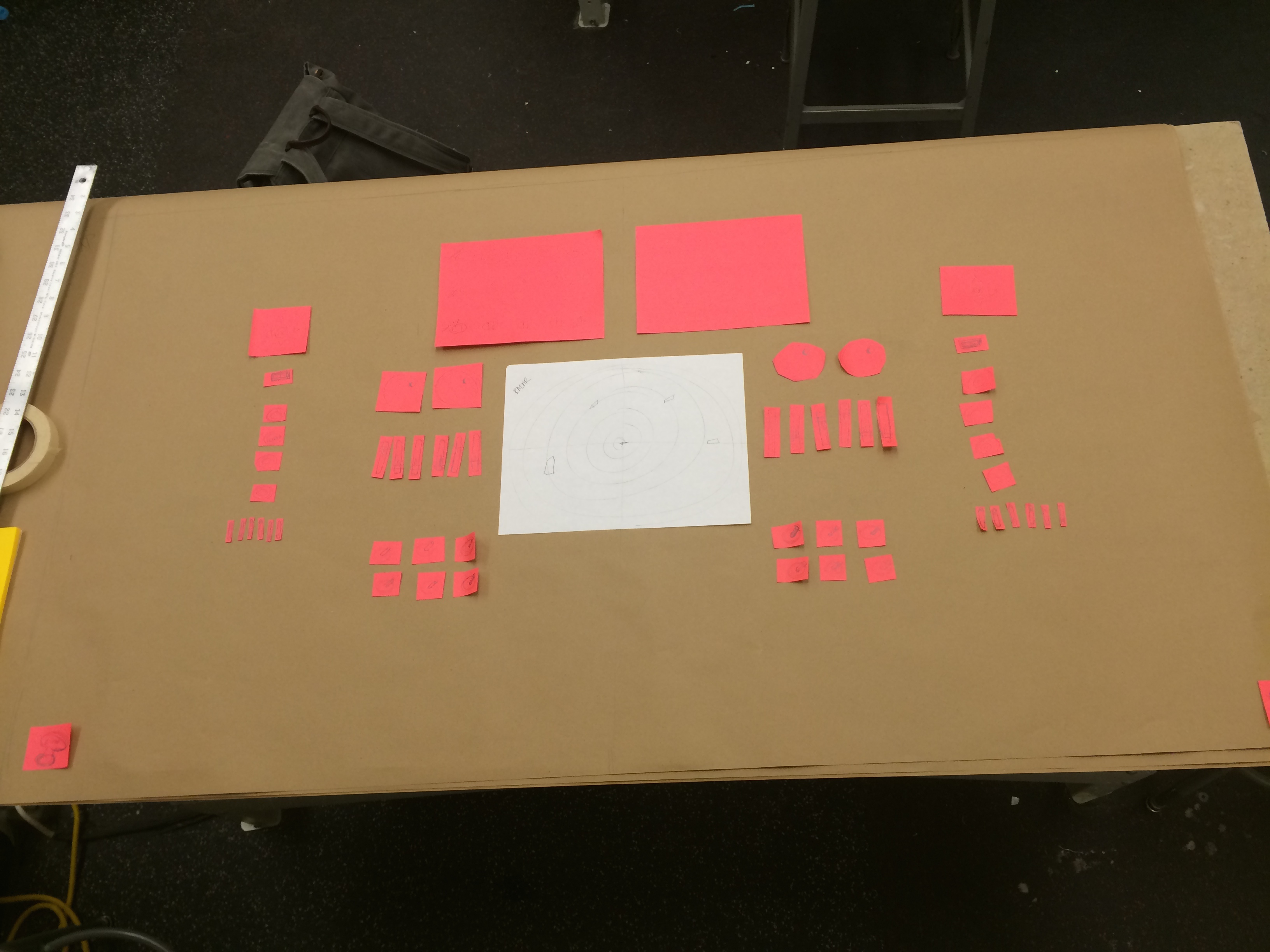

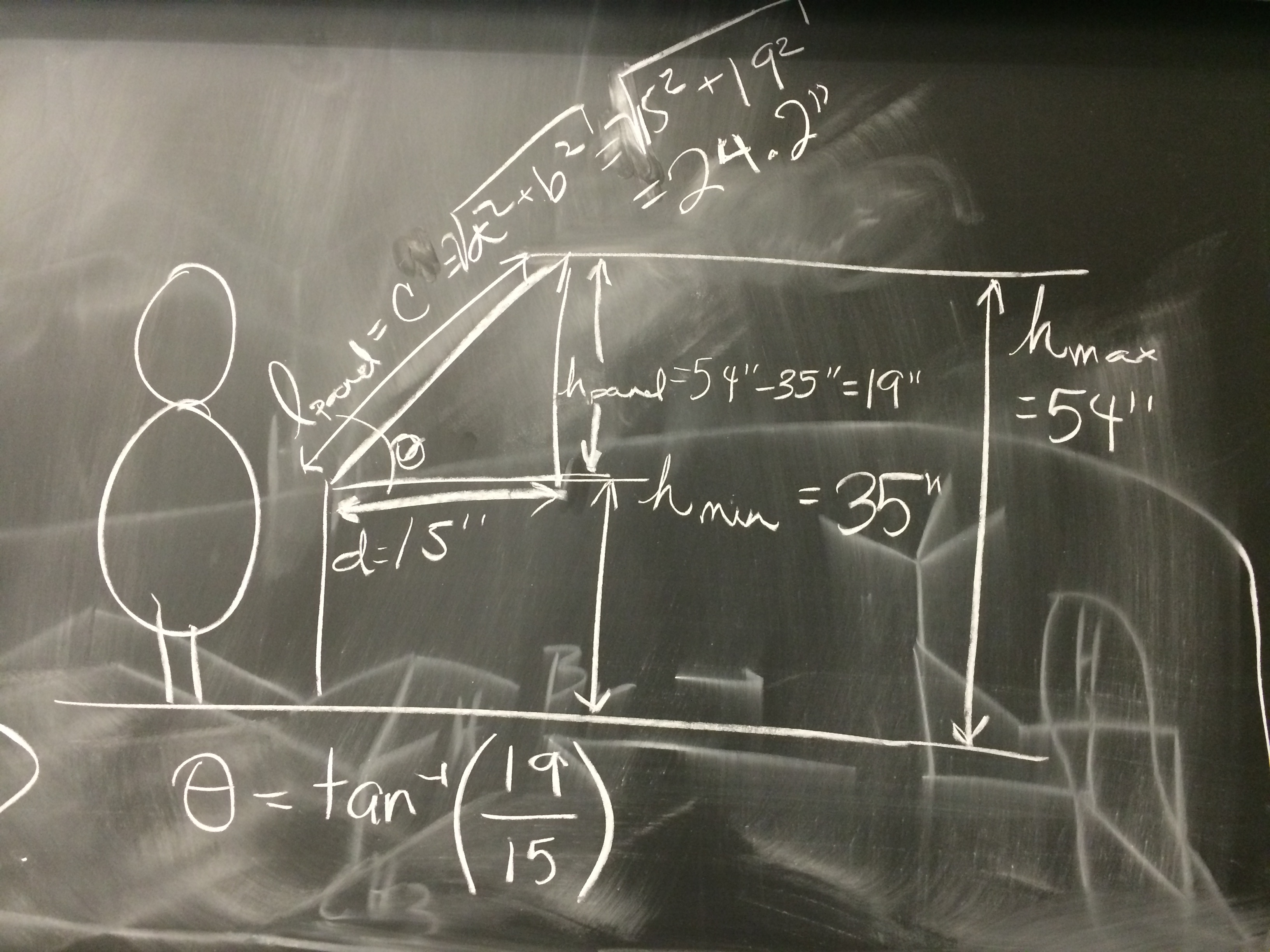
Finally, I gave a lot of thought to the placement of the buttons, both relative to each other and relative to the the person's stance. I discovered that some buttons were more meticulous to operate (like a slider whose pin would have to be placed at a certain level between 1 and 10 (a space differential of approx 10 cm) and woudl be best served around the waistline of our user so that they can operate the button with most tact. Other buttons not as skill-demanding, like a simple press/despress button, can be easily maneuvered correctly when placed at the topmost row of the panel to be pressed when the user's arm is stretched out.
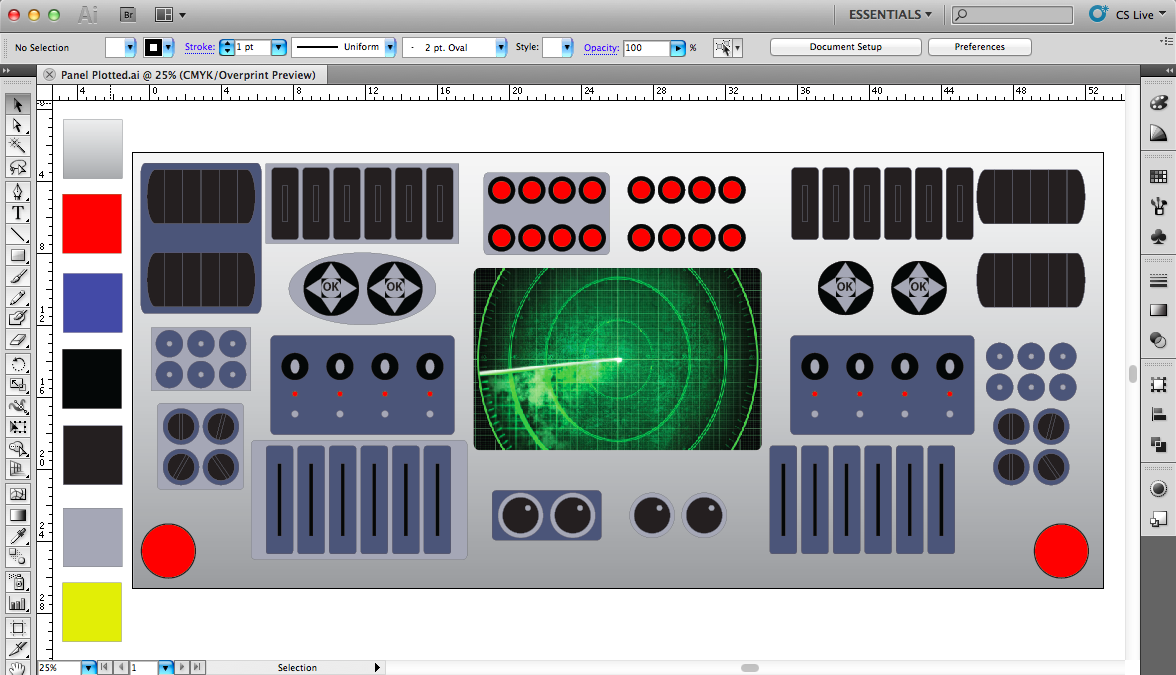
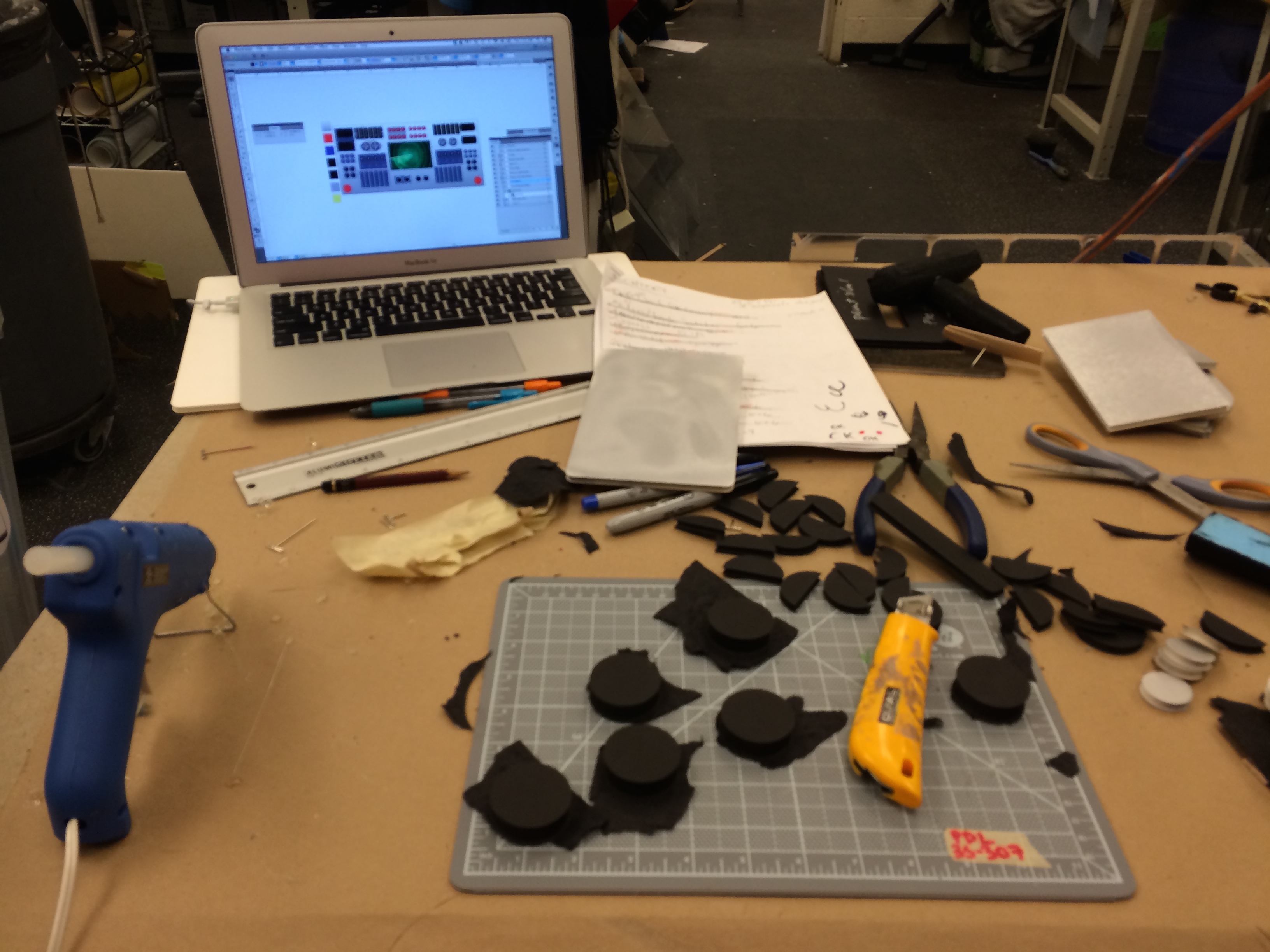
I used Illustrator to play with different button configurations and decided on a template for to plot twice and lay over Panel B and C in order to get a sense of what it would all look like when it came together. There are still decisions on the layout to be made, like whether both stations at each panel are going to be mirror images of each other, or have completely different button layouts. Also, in our current game design, the button functions needed on Panel C (to launch the fighter jet) are different from those needed on Panel A and B (to choose among fighter jet options, weaponry, and armour). If we were to move forward with the Control Panel, the modular buttons mounted on and off subpanels in this sketch model will be useful in configuring different options.
